D-TEST (PHQ-9) | APP REDESIGN
Project Scope: 4 weeks / 80 hours
Role: Strategy, Research, UX Design, UI Design
Tools: Figma, Survey Monkey
INTRODUCTION
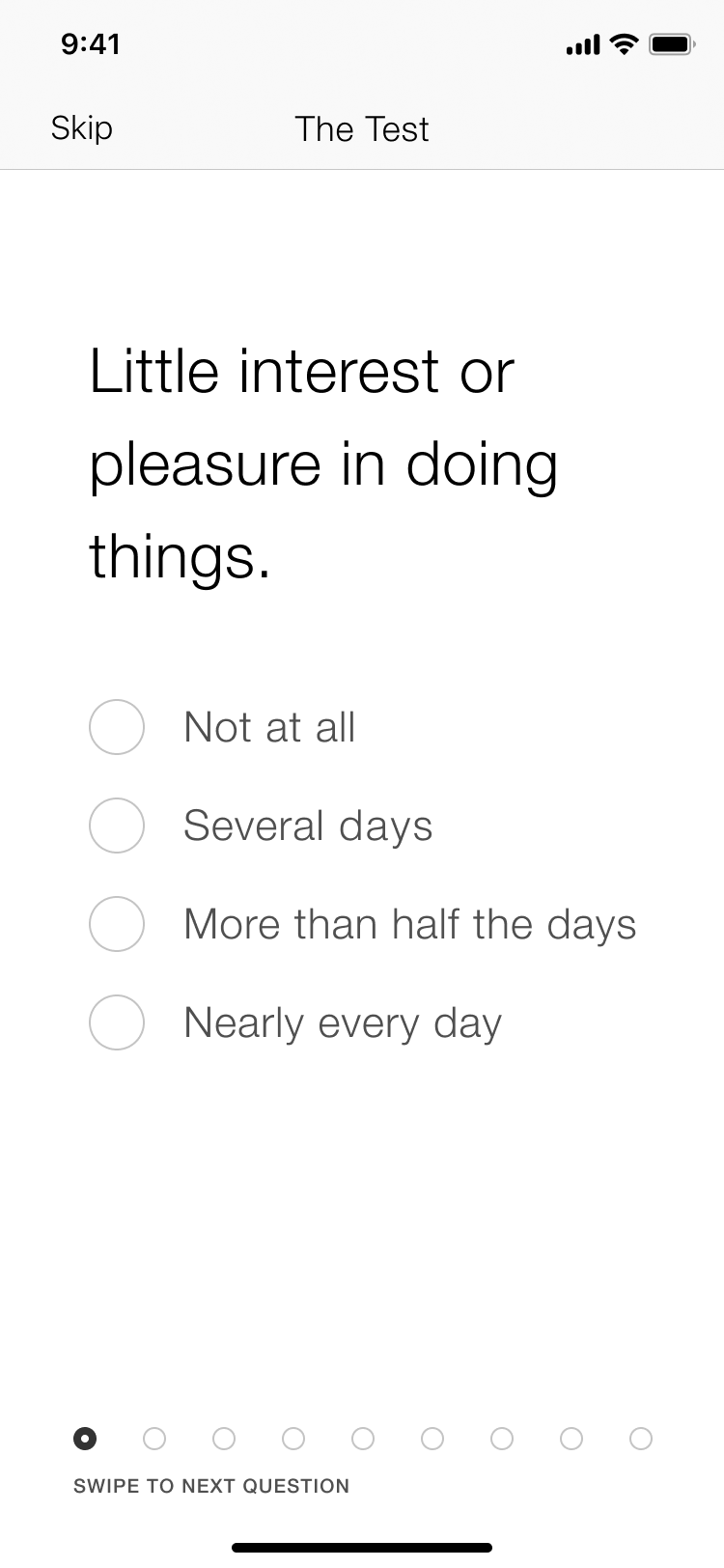
The Depression Test (D-Test) is a powerful tool to diagnose depression and monitor treatment response. The test questions are based on Patient Healthcare Questionnaire-9 (PHQ-9), the most widely used and trusted questionnaire among mental health professionals. The test can be self-administered.
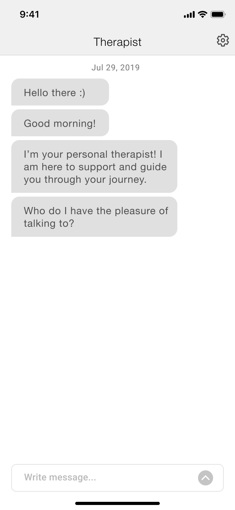
The app was designed and released in 2013 and currently gets downloaded approximately 500 times a day. D-Test now wants to add an AI chat feature, re-organize content and potentially add another feature to enhance the app. In addition to this, D-Test wants to set up a design system, create a sitemap and user flow to reference going forward - This was never created when the app was designed.
GOAL
Add AI chat feature
Improve information architecture and reorganize content
Explore areas of opportunity for a potential additional feature to add more value
Create a design system, user flow and sitemap to reference going forward
PROCESS
01. RESEARCH
In recent years, there’s been a proliferation of mental health apps available to smartphone users. These reasonably-priced, or most often free, mental health apps offer a wealth of resources that make therapeutic techniques more accessible, portable, and cost-effective.
MARKET RESEARCH & COMPETITIVE ANALYSIS
Identified and analyzed other apps in the market that help track mood patterns and offer support. This was an essential step to understand what kind of tools are offered, identify their strength & weaknesses and find areas of opportunity. Then created provisional personas to empathize with the user and understand pain points & expectations.
Here are the key takeaways:
Most of competition offer free features and premium features. Most popular premium features include:
Reading & listening materials
AI chat feature
Guided meditations
Free features found:
Evaluation test over an extended period of time
Mood tracker
Sharable reports
Journal
Quotes
Peer to peer community support
Platform to share problems anonymously and view other people’s problems
Live venting
Weekly Spotify ‘Positivity’ playlist
USER PERSONA
Establishing a connection with the user and building empathy is essential to create effective solutions. I created below user persona based on my research findings. The goal of this exercise was to gain insight into the user’s behavioral patterns and build empathy to better understand their goals & frustrations.
SURVEY
In order to gain further insight into the user, I created an anonymous survey and recruited users based on the provisional personas. Here are the key takeaways:
Number of Participants: 25
Gender: Female (19), Male (6)
Age: 18-24 (2), 25-34 (13), 35-44 (9), 55-64 (1)
There is opportunity to get more users to use D-Test. Most participants have never taken a depression test but a significant number of people are interested in taking the test and/or use an app to track their emotional journey.
Adding self-help listening / reading materials to D-test should make the app more valuable to the user and may increase the number of returning users as this is the top method of self care among participants.
Content addressing anxiety and burnout should be top priority as these are the main persistent negative emotions participants have experienced over an extended period of time. Hopelessness and loneliness follow.
Over long term, adding guided meditation and breathwork therapies may be taken into consideration by D-Test as these were also popular alternative methods of self-care.
D-Test's plan to add an AI chat feature seems valid as venting, confiding in friends & family and speaking to a professional were also popular methods of self care among participants.
Click here to view detailed survey results.
FINAL CONCLUSIONS
Based on my findings, here are the high priority features:
AI chat feature that the client is looking to add would be offered for a fee but should include some free features.
Adding reading & listening materials would add value to the app based on both primary and secondary research.
Potential futures that can be added later:
Based on my survey findings and market research, people who take this test tend to return to retake the test. In addition to push notifications to remind users to take this test again, adding new content at regular intervals may create more returning users. This could be achieved by adding the below:
Articles, videos and/or podcast.
Guided meditations.
Weekly/monthly playlists to promote positive thoughts.
Inspirational quotes.
02. INFORMATION ARCHITECTURE
SITE MAP
First I mapped out the current screens and explored ways to improve the current architecture. Then I made room for new features and content that I am planning to make more visible. Here is the sitemap:
03. INTERACTION DESIGN
In previous phases, I explored user needs, researched the market and mapped out the site based on user feedback. In this phase, the content and the flow of the website is further explored.
USER FLOW
I created a user flow to show how the user can navigate through the site. I explored all 4 of my provisional personas and created different scenarios for each. Here’s the user flow:
WIREFRAMES
High-fidelity responsive wireframes were created for the home page using Figma.
INITIAL PROTOTYPE
Prototype was created on Figma to test and validate designs at this early stage. Click here to view the prototype.
04. USER INTERFACE DESIGN
This phase focuses on branding, setting up design language and polishing up our design.
UI DESIGN
After reviewing the initial prototype with the client, I made necessary revisions and alinged. Then I moved on to creating high-fidelity wireframes based on the existing design elements.
UI KIT
Gathered the existing icons, typography and elements and combined with the newness coming from the redesign.
HIGH-FIDELITY PROTOTYPE
Revised the prototype with the UI version to be able to better visualize the app and test with users in the next phase of the design process.
05. ITERATION & IMPLEMENTATION
Last phase of the project was focused on validating our designs with users.
USABILITY TESTING
Usability tests were conducted with three different participants. Here’s a summary of my findings:
All users were able to complete tasks without problems.
There were a few comments on potential UX improvements.
There was one comment on a potential UI improvement.
Users responded positively to the visual elements on the app.
AFFINITY MAP
I created an affinity map to summarize and visualize my findings:
NEXT STEPS
Having completed usability tests, I identified areas of improvement and made necessary revisions to my designs.


